Instructor Certification Program UX
Details
Client: Texas Dept. of Transportation
UX/UI Designer: Hoyt Haffelder
I was brought into this project to design a site for the instructor certification program. The program allows staff to record their efforts for training, developing, participating, and other education related activities.
I purposefully omitted and obfuscated confidential information in this case study. All information in this is my own and does not necessarily reflect the views of TxDOT.
Design before function?
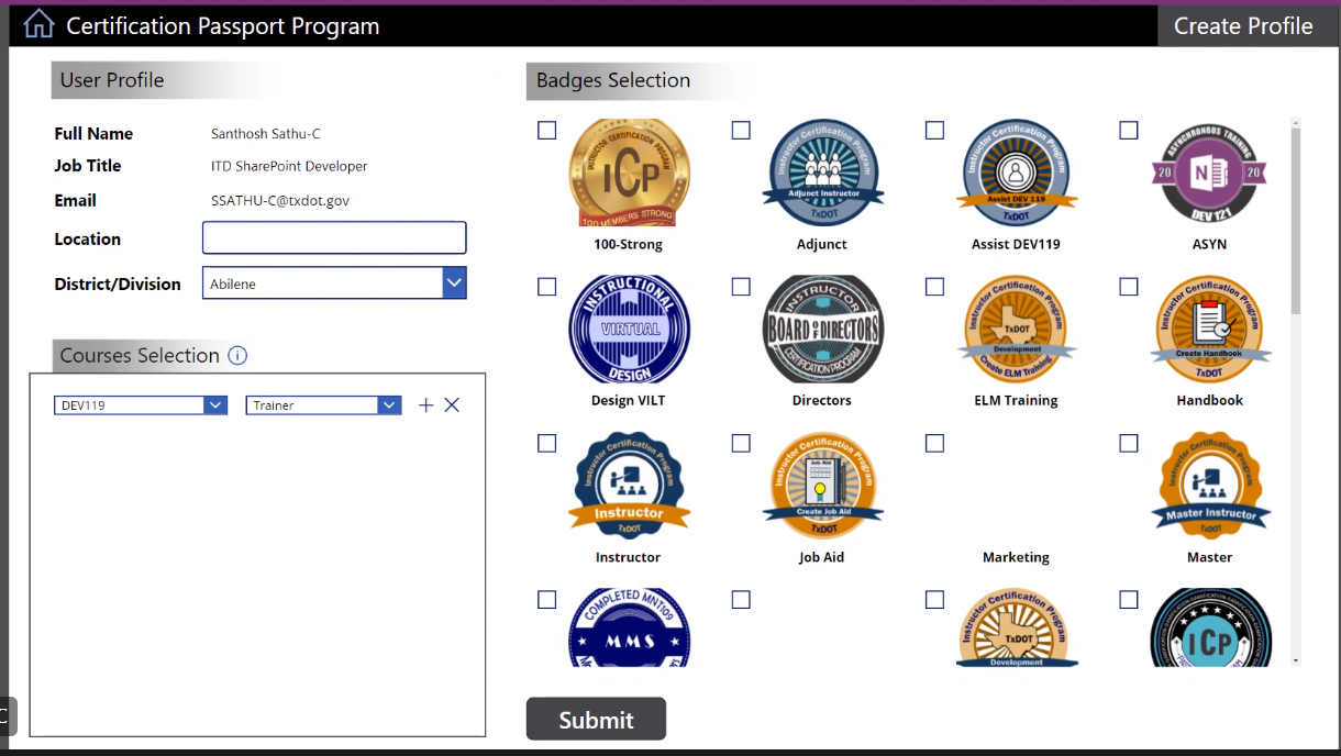
The developer created a few screens before I joined the project.
Clients like to move quickly into design so they have something to react too. I don’t blame them, the design phase is the most tangle project phase. Clients often have trouble visualizing trees when looking at seeds. But it’s my responsibility to guide clients through the process which requires trust.
The screens created by the developer were reactions to design feedback without a coherent user experience. The first thing I did was to sit with my client and understand the overall process for the instructor certification program. Once I understood the process I could begin designing the site.

Landing Page Wireframe
Home Screen Wireframe
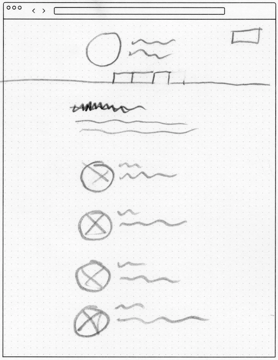
User Flows
The best way to understand the process is to write it down.
Creating a user flows not only helped me understand overall process but often uncovered issues the client hadn’t thought through. This discovery phase yields many rewards by creating consensus and builds a common understanding between the client, developer, and myself.

New user flow diagram

Existing user flow diagram
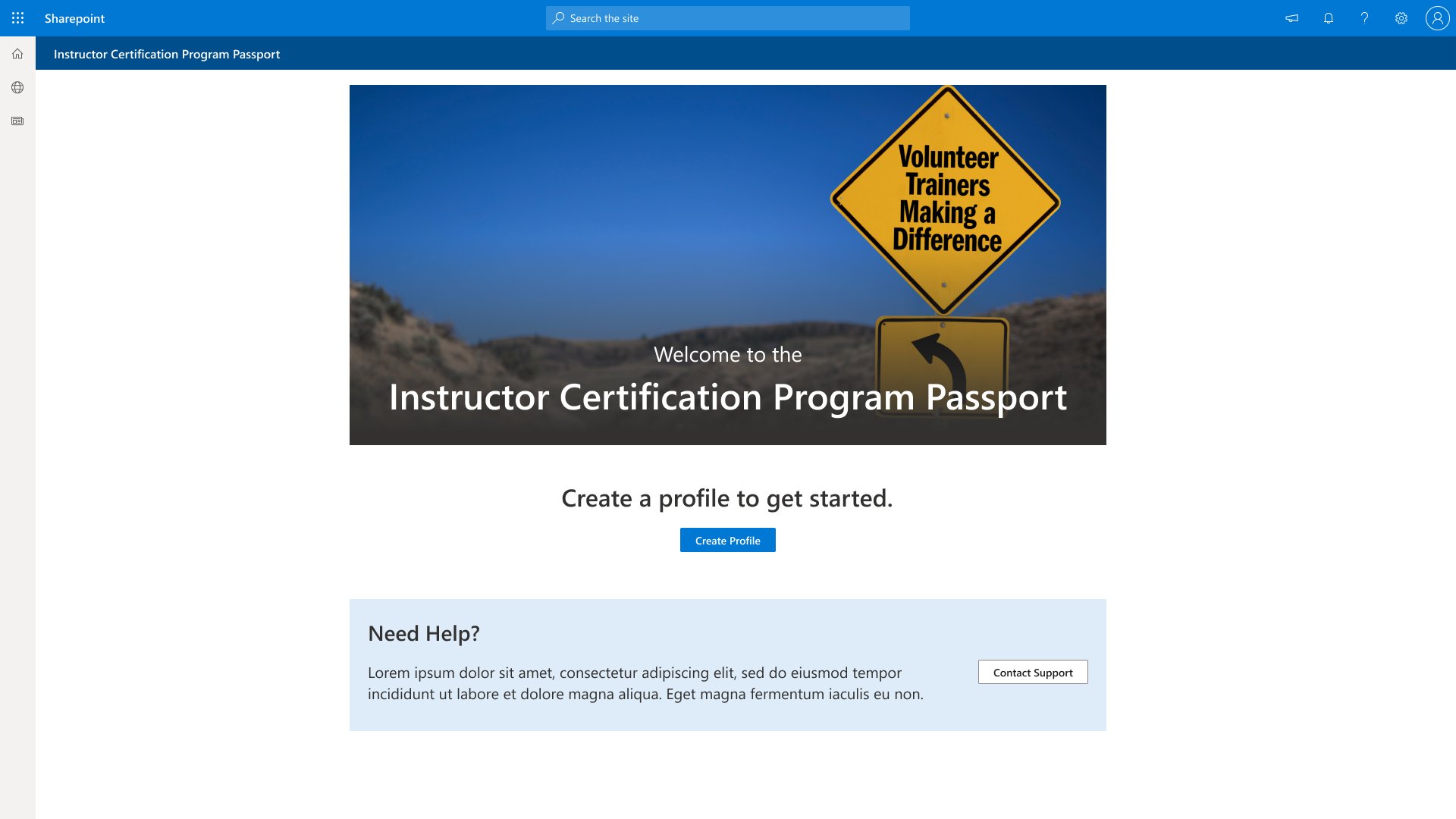
Rapid Low Fidelity Wireframes
Iterate quickly to find solutions before you love the design.
Sketching saves a lot of time allowing you to check multiple solutions quickly. We worked through iterations to land on a single screen approach.The single screen solution uses tabs to switch between screens. This helps the users feel in control and that the process isn’t elaborate or time consuming. It also reduces learning time for users which should increase adoption.

Landing Page

Profile Page

Activity Details Page

Submit New Activity Page
Rewards and Information Page
High Fidelity Prototype
Time to design.
High fidelity prototypes are about implementing the agreed upon functionality from the previous phase. It made sense to use Microsoft’s Fluent design system since content management system is Sharepoint and the user base is almost exclusively window’s based. The design high fidelity wireframe was built in Figma to hand off to the developer.
Landing Page

Profile is being reviewed

Profile is rejected
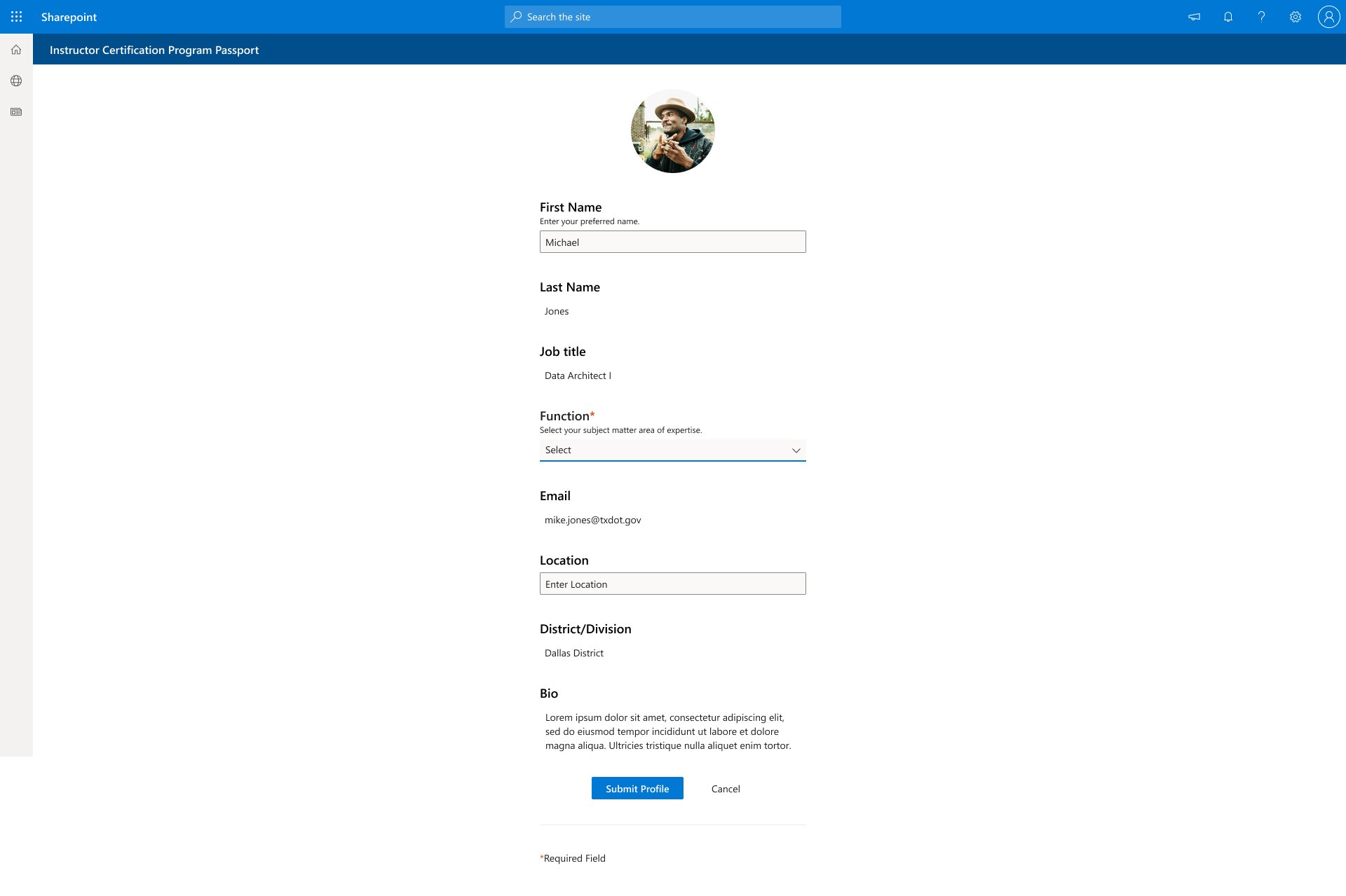
Profile Creation Screen

Profile Update Screen

No Activity Screen

Submit New Activity

Pending Activity Screen

New Activity Screen

Rewards and Information Screen
Conclusion
Overall the client loved the user experience and it was great creating a functional site designed to fit their program.