UX Case Study: Texas Clear Lanes
Details
Client: TxDOT
Content, Design, UX: Hoyt Haffelder
Development: Jake L.
The Setup
The Texas Clear Lanes Website needed to be refreshed. The information architecture on the site was not conducive to the best user experience and the design was a bit dated.
The Challenge
Refresh the content and design to produce an engaging experience underscoring the cost of traffic congestion and how TxDOT is addressing the issue.
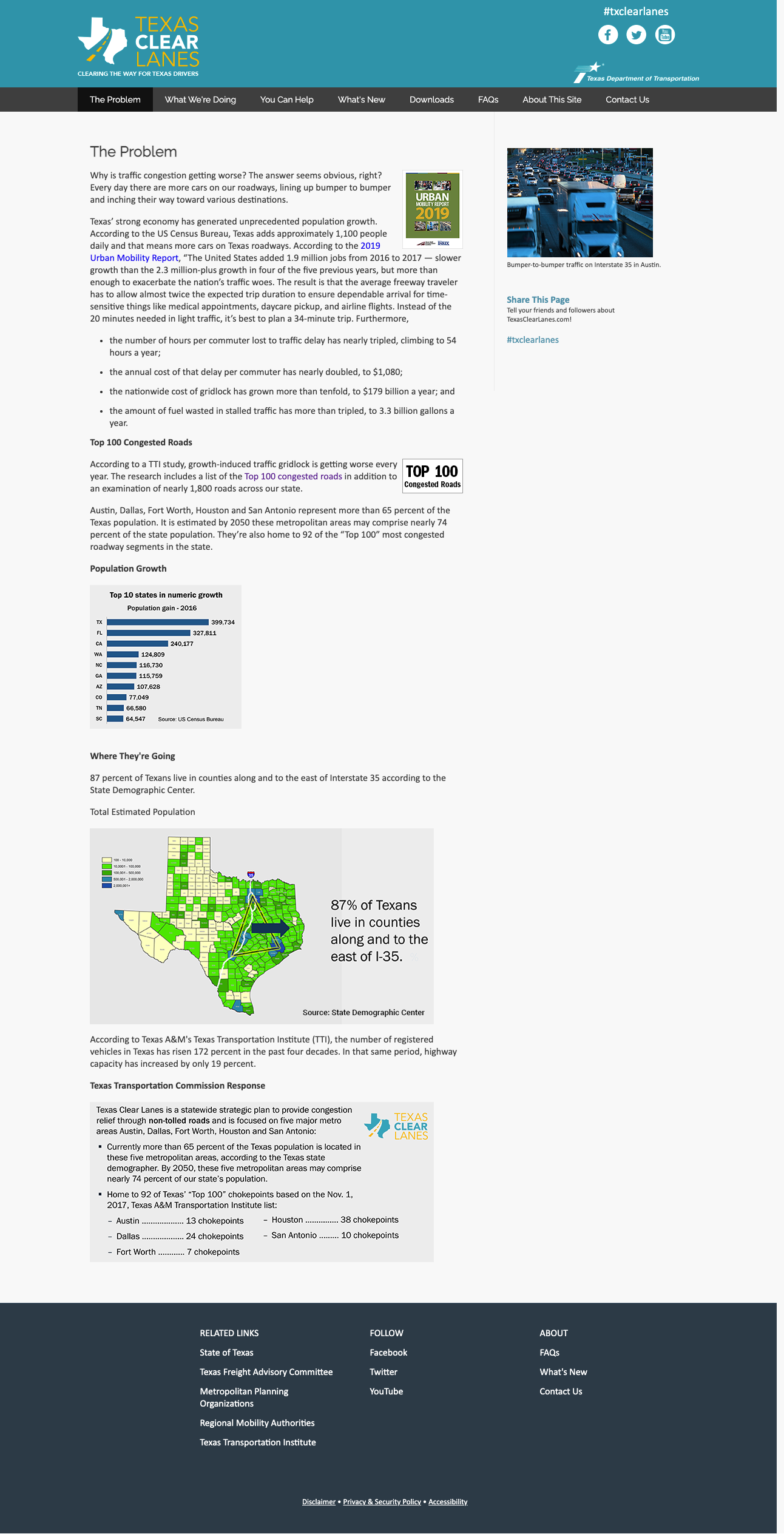
Previous Design
The previous site’s visual design and information architecture were dated. In addition to content and visual design challenges the previous site didn’t meet accessibility standards. This wouldn’t not mere be a lift and shift but a reimagining of the entire site from top to bottom.


Wireframes
We developed wireframes that simplified the information architecture and reinforced the project goals. The simplified site included new content features making it easier to find content through improved navigation and semantic content sections. We also design mobile first with a fully responsive approach allowing the content to be accessible from any device which was a major improvement.

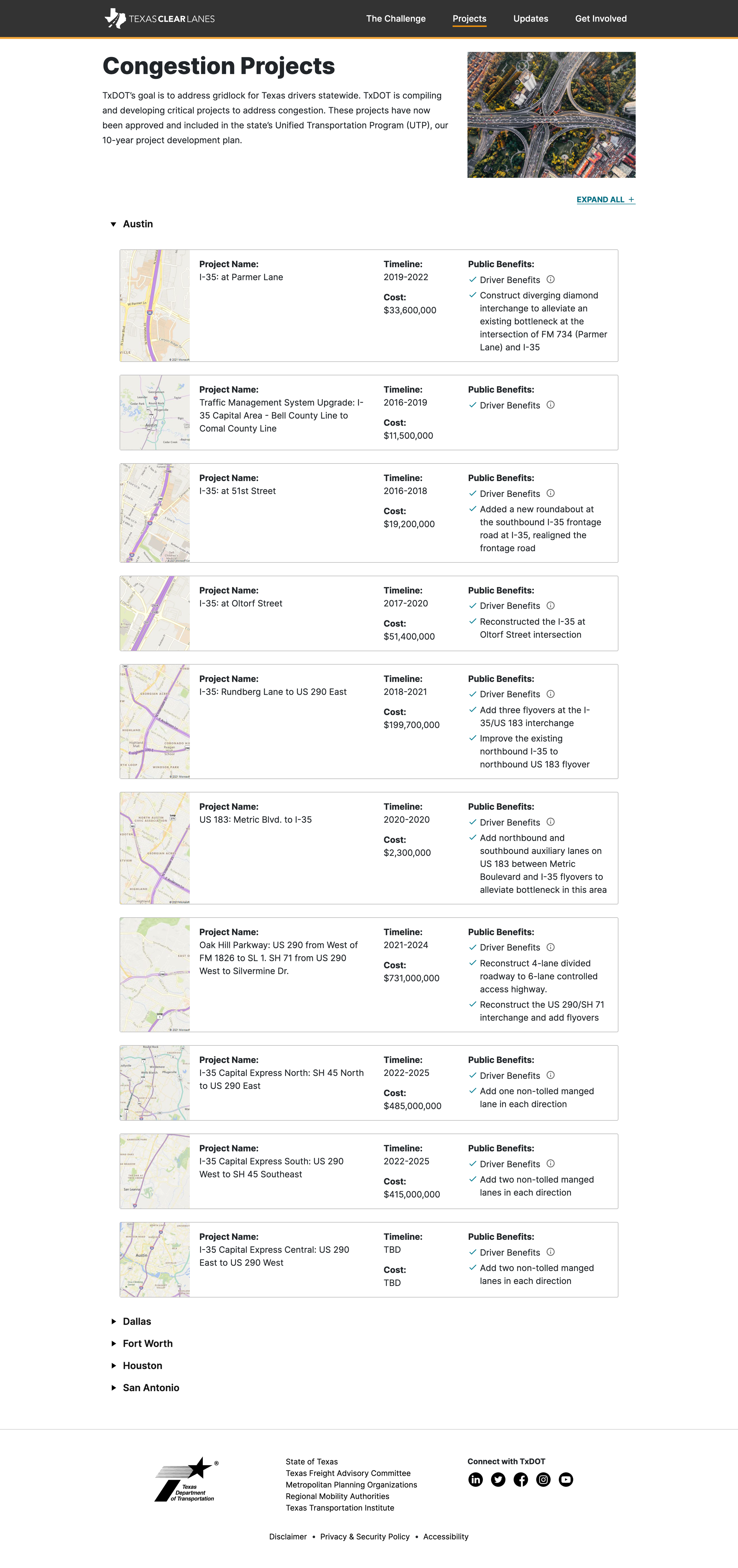
Final Design
The new Texas Clear Lanes site featured updated content, improved navigation, semantic design and is fully responsive. In addition the site met accessibility standards and greatly improved the user experience while.
Mobile Site


Desktop

Homepage

Article Page
Issues Page